Working with the quirks of GameSalad – Part 1
November 5th, 2014
Positioning and scaling actors based on device width in GameSalad
We don’t use GameSalad for everything, but we do use it for prototyping and making quick, simple games. Despite being really easy to use, GameSalad is not without frustrations.
You may have tried to set an actors width to screen width, only to find that it scales incorrectly and ends up either too big or to small depending on the device (assuming you’re using resolution independence).
This was driving me CRAZY. My project was set to iPad portrait and it looked fine on ipad, but on my iphone 5 the actor would be WIDER than the screen width. ARRRG. I even tried hardcoding the actor width to 640 knowing that was the correct number. Still too wide.

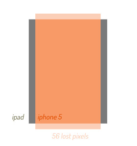
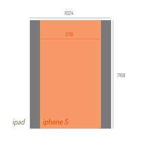
So what’s going on here? Well the project is set to ipad which means it starts at 1024×768. Now, the iphone 5 has a width of 640, but a height of 1136. That means if you laid it pixel for pixel on top the ipad resolution you would be leaving off 56 pixels on the top and the bottom.
In order to fill the iphone 5 screen completely, the phone screen has to be scaled down so that its height matches the device height. This means that even though the real device height is 1136, in GameSalad it will be the scene height, 1024. Since 1024 x 640 wouldn’t be the right aspect ratio, we know that the height is now different too.
We can do a little bit of math to determine how much the scene was scaled, and extrapolate the width. This is the formula I use:

(1024 / (game.Screen.Size.Height*2) ) * game.Screen.Size.Width
It’s pretty simple. We start by dividing the scene height (1024) by the device height (because of the way GS strangely handles retina, we have to first multiply height by 2 to get 1136). This gives us a ratio of scaling. In this case the whole phone screen is scaled to .9x of the scene. We can then apply that to the device width (640) to get the adjusted width of 576.
I usually store this as a game variable SCREENWIDTH so I can access it anywhere. Another nice trick since you now know the real screen width, is using this to position items relative to screenwidth.
