The Art of SmuggleCraft Vol. 1 – Crafting Colors
August 4th, 2016
Hey! It’s Tj, and I’m the technical artist on the team! Here’s what I’ve been up to recently:
This is something we’ve been trying to get working for the longest!!!
Color Grading and tonemapping: A process that is normally used in Photography and Filmmaking to enhance colors, and really make things pop.
Color Grading is why all the shadows in The Matrix look green; And it’s what makes period piece films look reminiscent of earlier times. A lot of emotion and atmosphere can be conveyed through which colors we pick, and Color Grading helps us get closer to those ideal colors.
If you’ve ever used Instagram, then you’ve already been introduced to a very basic form of Color Grading! Filters that you apply to your photos can be used to change the lighting of a photo, make it more idyllic, or look more nostalgic. Color Grading at its core is a dynamic and customizable Instagram filter.
Getting the settings to a place where you want them can be a real puzzle. I mean look at all these sliders!!!! :
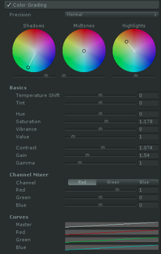
A lot can get hecked up if any of the sliders aren’t at optimal values. For example, you might find yourself saying things like: “The shadows are too red!” “The scene is too bright!” “The scene is too dark!” “…The scene is somehow simultaneously too bright and too dark!”
Fixing one problem can cause a lot of others to arise. There’s also this: “This scene looks fine on my computer, but on the TV, everything looks terrible.”
When color grading, you have to take into consideration the varying devices that your game will be shown on. Problems like these are why so many games have the “Adjust brightness until you can barely see the logo” prompts at the beginning of the game. Everyone’s TVs could have very different color settings.
These prompts are good, because back in the GameCube days, my brother and I would always argue with each other about what we called “Tighter or Brighter”. Before playing a multiplayer game, we would adjust the color settings on our TV. “Tighter” meant the game looked dope at these color settings, but we honestly couldn’t really see what was going on.
“Brighter” meant we could see everything, but the colors looked washed out! So we’d take a vote on Tighter or Brighter and then start playing (usually, brighter won).
That aside, here are examples of how Color Grading has influenced the visual fidelity of the game:
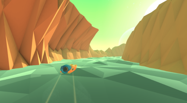
Without Color Grading:
With Color Grading:
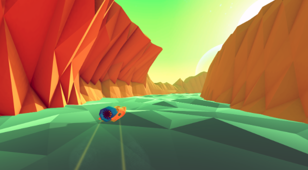
Since our game uses procedurally generated levels, different color grading configurations have to be made for each lighting condition, so every color can be complemented and accounted for. In the example above, I decided to bring out the reds to bolden the color of the terrain and made the lower values (shadows and anything dark) lean towards purple, seeing as the green of the sky and purple are on opposite sides of the color wheel. The colors are able to compliment each other.
Without Color Grading:
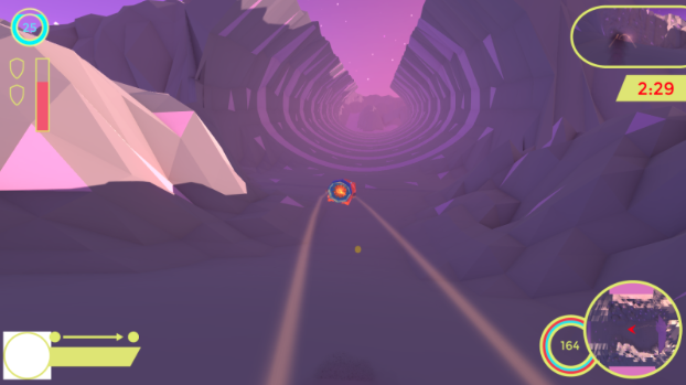
With Color Grading:
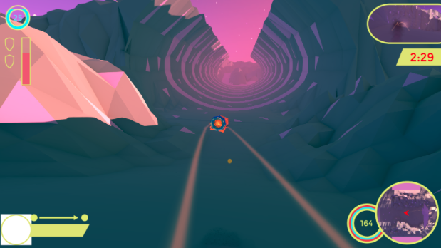
For this lighting condition, the main problem was clarity. Everything was roughly the same hue, so it made it hard to see things at a moment’s glance, which super important in a racing game. So I made the low values even lower so that the shadows stand out more, and shifted the colors to another hue so that there’s more of a distinction between the terrain and the sky.
The night sky was probably the hardest to balance. We needed it to look like night, but we didn’t want it to be so dark that the player couldn’t see where they were going.
Without:
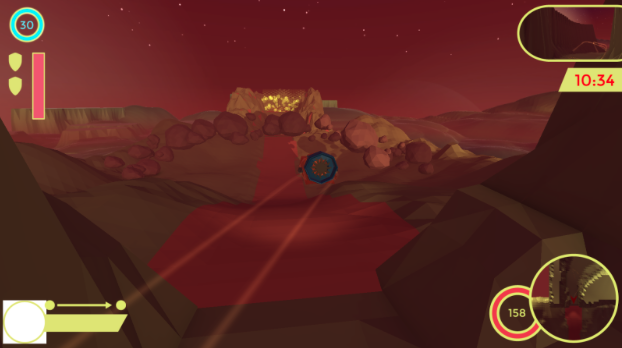
With:
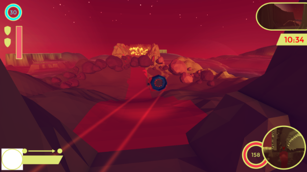
The reds are more saturated, and the lower values have been inched more towards blue so that they balance against all the red in the scene. The overall color curve has also been increased, simply because the scene was too dark after the color grading was first applied.
So that’s basically what I’ve been doing to make the colors in the game stand out more. Follow Happy Badgers on Twitter to see more pretty visuals created by @_Teejay5 and @danahuth!